
Defying Ubiquity
Not long ago, it was taboo for a winery to venture away from mundane label design. You know, an image of the estate and vineyards plus a name—perhaps embossed or foil for a bit of oomph. Today, a refreshingly different approach considers design-forward artwork to metaphorically tell the story and create the desired intrigue about what’s in the bottle.
Hand-crafted labels on small production wines are proudly crafted with love, each a work of art, a heartfelt expression to make an emotional connection by whispering quality, elegance, timelessness. Wine labels such as these can tell stories you won’t see on a website, on a store shelf, or find on a Michelin-starred menu.
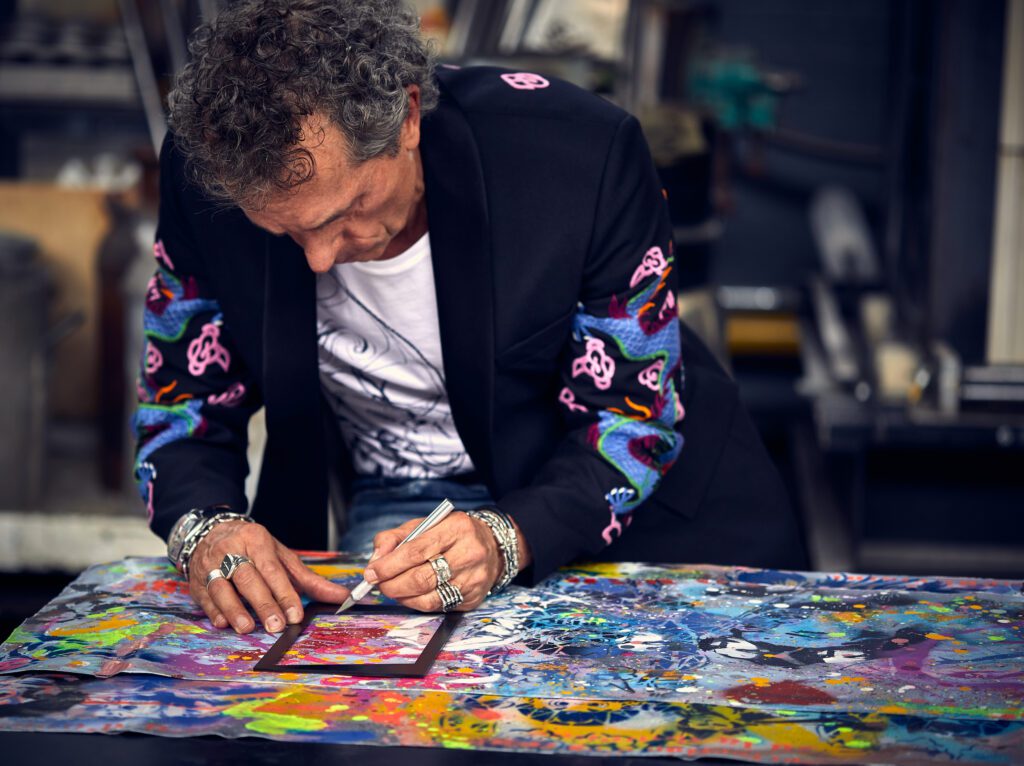
Haute Living curated this look at special labels with expert guidance from Angela Duerr, founder and proprietor of Cultured Vine, a Napa Valley-based luxury wine concierge and consultant to serious collectors.
ALOFT
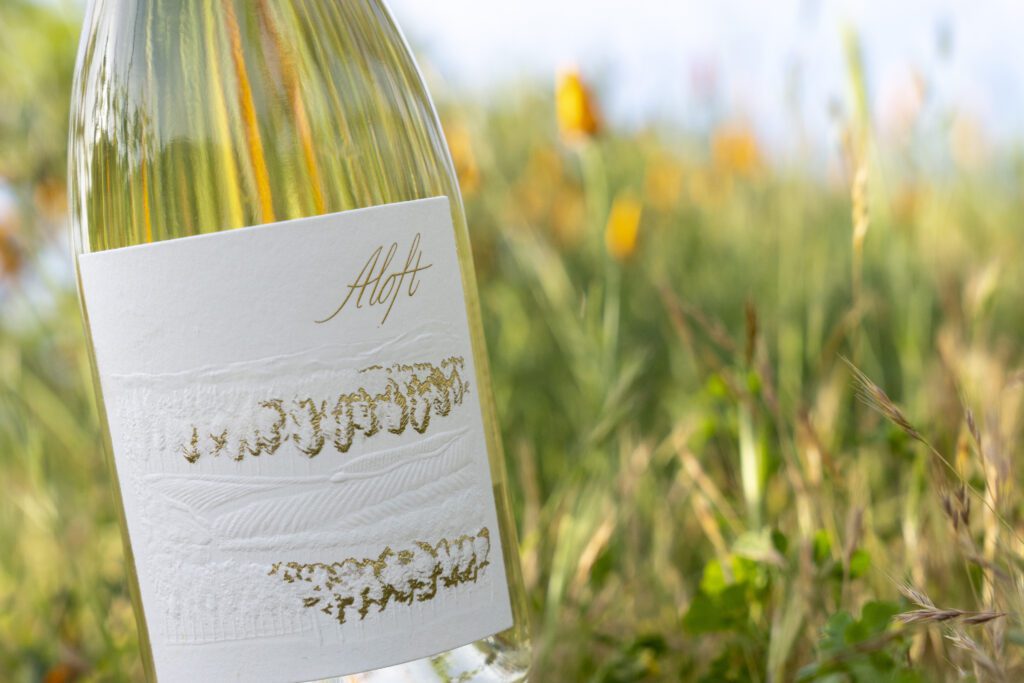
Few know the story behind the Aloft label, re-designed in 2011 by Alycia Mondavi. She explains its hidden elements inspired by years of family farming. “Looking closely, one will find the head of a mountain lion and the outline of a snake embedded within the rolling hills and vineyard scene.” Why? “Cold Springs is tucked away in a forest of tall pines and manzanita trees, the perfect sanctuary for a mother mountain lion and her two cubs. Yet, it was within close proximity to a neighborhood. After many family discussions, these wild, majestic cougars had to be safely relocated to a new home due to their territorial behavior, but still hold a special place in the Aloft story. In addition to the forested property, the rocky soil commonly found throughout Howell Mountain provides ideal drainage and desired homes for snakes. These snakes play a unique role in the family’s pledge to farm sustainably.”
DARK MATTER
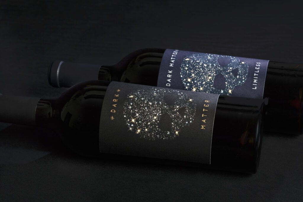
First designed in 2005, Dark Matter was created by the Mondavi Sisters as their thumbprint in wine. Having grown up under the tutelage of their father, Marc, and grandfather, Peter Mondavi, Sr., the siblings were inspired to continue their family legacy to produce wine with the same passion and devotion as earlier generations. Dark Matter, a theory in itself not yet fully explained or understood, resonated with the sisters and their position in the industry—still working to earn their stripes. They worked with Australian designers to create a label reflecting vast possibilities and open skies, but wanted to incorporate an edgy twist, something different from the traditional Napa Valley norm. Alycia Mondavi recalls, ”You can only imagine in 2005 the comments we received…..’skulls represent death and poison,’ and ‘this design is the kiss of death,’ or ‘a label with a skull does not reflect high-end and luxury.’ These comments only fueled our decision to push the boundaries and run with a constellation of stars that form a skull. Perfect for the name Dark Matter!” Gigi, youngest of the four sisters, added “Limitless” to the brand in 2011. “It was only fitting after our grandfather constantly challenged us and our father taught us there are no limits.”
STONES WINE
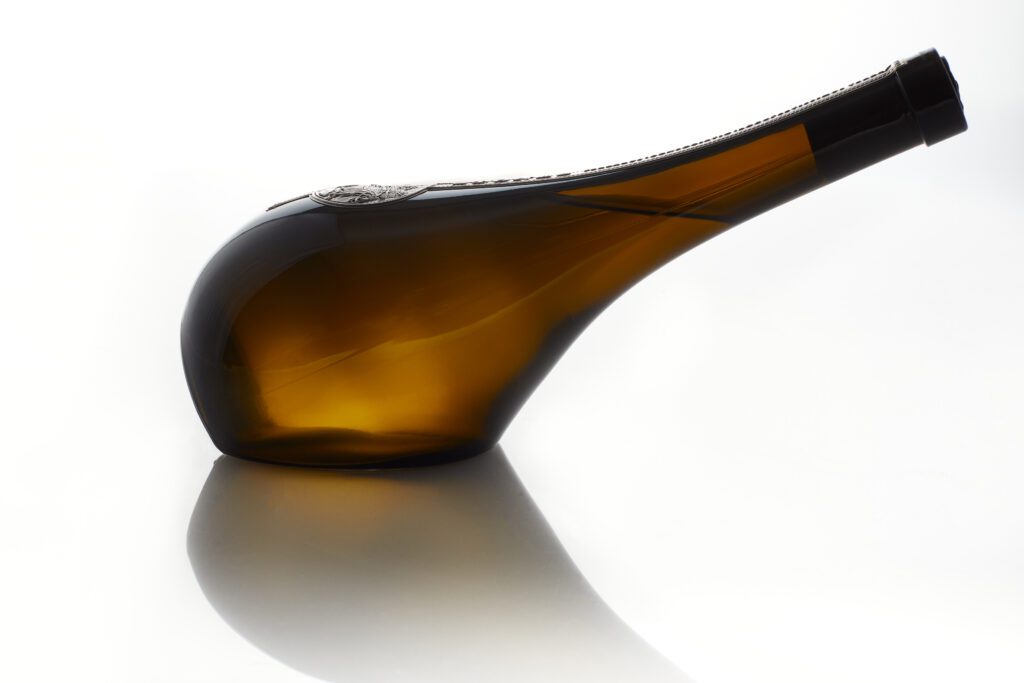
It’s all in the details. The Hermés of wine. Founder and Proprietor Lawrence Fairchild takes a page from art and fashion to craft each of his Stones Wines bottles with labels that require an 18-month process. They’re individually hand-crafted, illustrated, pressed in France, polished, and applied with precision. Stones Wines are made available only five times per year and always sell out in minutes. The first, a 2017 Chardonnay, makes its debut this year. From the Russian River Perrarus Block A3 Vineyard, this collection has white peach undertones and a perfectly balanced, long finish. An elegant masterpiece, it is priced at $175 and set in a hand-pressed bottle that can actually stand on its side.
PERRARUS 2
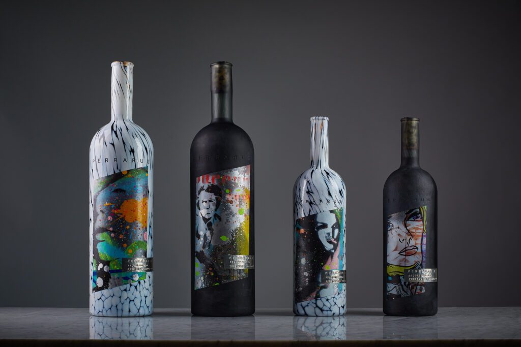
Lawrence Fairchild’s ever-evolving Perrarus (Latin: Very rare, exceptional) collection of large format Cabernet Sauvignon (price range from $3,500 to $8,500 per bottle) are presented in handblown glass bottles with designs that change each year. Never duplicated, each of the 350 bottles has a unique label to fit the year’s theme and are made available by lottery only in a distribution limited to one per member. This year, Perrarus 2, The Art Series features labels made of an original artwork from renowned French artist Cédric Bouteiller.
TOR CHASING WINDMILLS
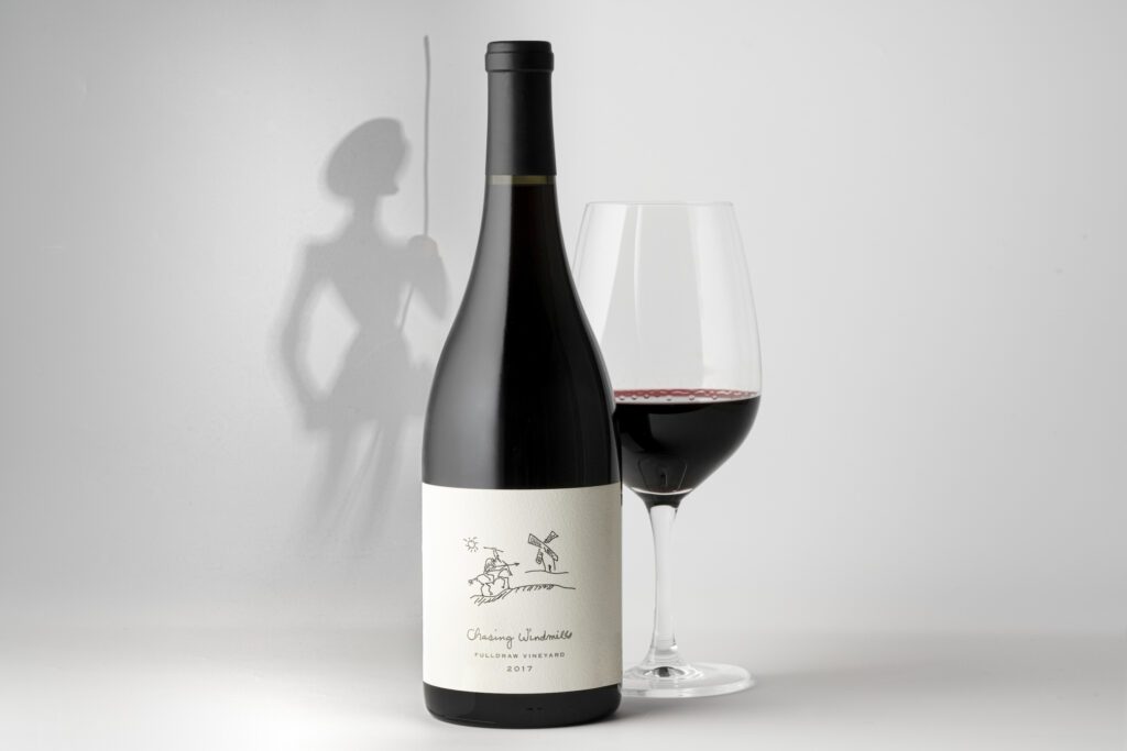
The label image was hand-sketched by proprietor Tor Kenward and the name “Chasing Windmills” is a reference to Don Quixote. Kenward says, “Grenache has kept us on our toes for a few decades. We’ve traveled all over California in search of gold like argonauts of old. Or, a better image…like Don Quixote we’ve suited up, jumped on our steads, set our eyesights to the horizon and charged. But, this is the end of the road for us as winemakers of Grenache. And we’re going out with a bang—straight collision with a windmill, spinning in a windstorm. Not the prettiest picture but it has impact. A powerful and sophisticated Grenache, the 2017 Chasing Windmills combines a full spectrum of flavor and texture, seamlessly balanced and long-lived on the palate.”
FLINT KNOLL
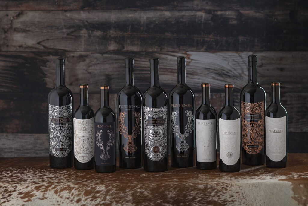
“The inspiration for the Flint Knoll labels originates from the filigree patterns used on some of the most prestigious European shotguns by Westley Richards, a bespoke British manufacturer since 1812,” explains Aaron Michaels, proprietor and vintner. “Every label is a hand drawn original work of art to showcase the beautiful wines we make. We construct a bronze die for each label and the labels are pressed one at time on an old German printing press from the 1960’s. Each label is hand applied and tissue wrapped for protection during shipping to the collector’s cellar.”
TRES PERLAS

(photos: courtesy of Renteria Family)
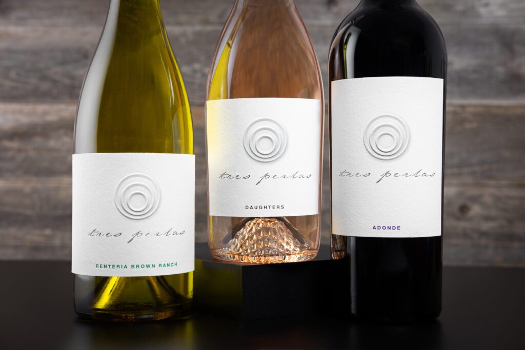

Luxury wine, luminous pearls, sensuous appeal, endless circles. The Renteria Family chose to use three rings on a modern wine label to represent three pearls for a trio of daughters, three generations rooted in Napa Valley, three varietals in the collection: “Daughters” Rosé of Pinot Noir, an Estate Chardonnay, and “Adonde” Cabernet Franc. Each bottle is hand-wrapped in tissue and sealed with colored wax to commemorate the vintage. Evocative, monochromatic labels prominently feature a raised, textured logo that feels good in the hand.
SIRE ESTATE WINES
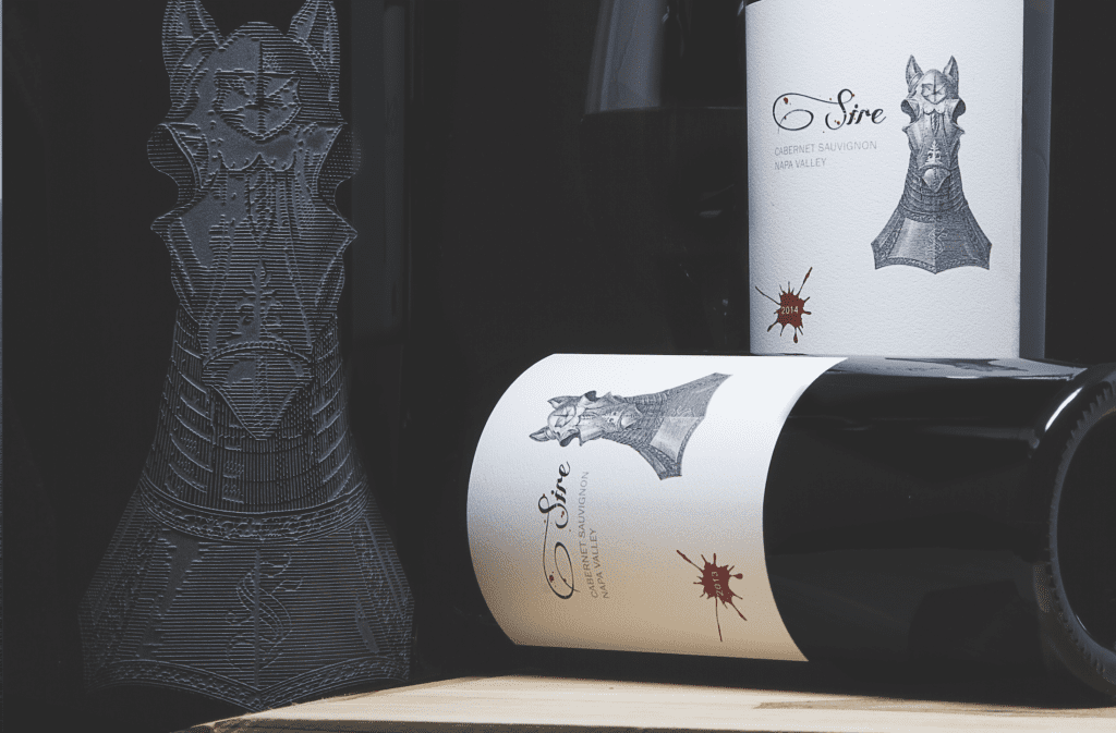
“So it is with fine wine, the best only come from top pedigree grapes (clones) with proper lineage, the heartiest rootstock, and the richest terroir in Napa Valley.” The mission of Sire is to source only the finest pedigree vineyards for winemaking, specifically, Cabernet vineyards. Proprietor Thomas Buck explains, “We patiently wait for just the right thoroughbred vineyard sites to work with…to produce that best-of-show wine. Each vintage of Sire is a purebred—an uninhibited expression of the vineyard site’s terroir. Like all things royal, Sire is both refined yet decadent. Well structured and balanced, with just a touch of hedonism.”
OVID Loc. Cit.
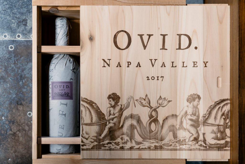
Madeleine Corson, the graphic designer who creates fine wine labels for some of Napa Valley’s family-owned wineries, says OVID’s classical choice is “inspired by the founders’ love of Roman history, Latin translations, and the writings of the canonical poet Ovid. Influenced by their library of antiquarian books, Loc. Cit. is letterpress printed on a natural deckle-edged sheet, and its wine story typeset in an eclectic style with bibliographic footnotes. Ovid’s poetry translations trim the bottle top in a colorful band, an accent of color on this exceedingly limited production wine.”
EXPERIMENT
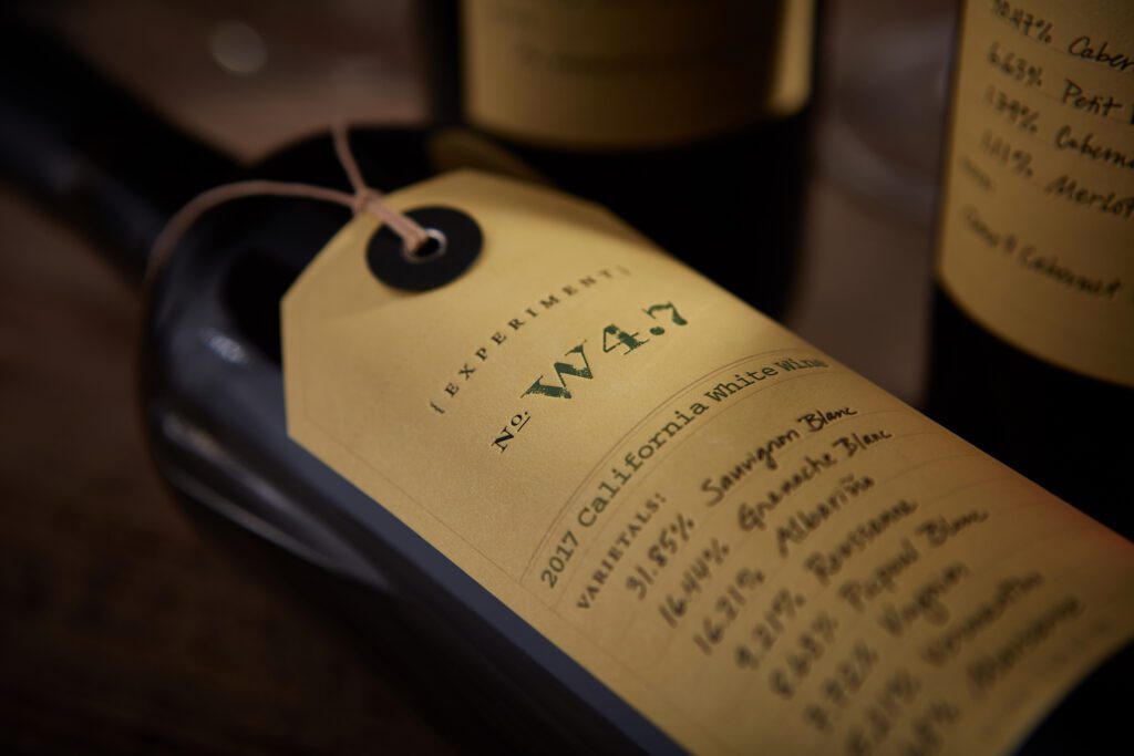
The bottles boast labels that can take a baby boomer straight back to eighth grade chemistry. “Curiosity and continuous learning is the ethos at OVID, as their team pursues individual blending experiments to expand collective winemaking knowledge and produce a new ‘experimental’ blend each year. Tagged with a grommet and handwritten wine notes, the Experiment label conveys an enology lab ambience, listing each vintage’s new code name and grape blend. The letterpressed label and tactile finishing details flag the series’ exclusively small production,” explains Corson. Winemaker Austin Peterson adds, “At OVID Napa Valley, there’s a commitment to the idea and practice of experimentation in many facets of grape growing and winemaking. More than just an indulgence of our curiosity, our commitment to experimentation enriches our understanding of our vineyard. Experiment wines are the result of this process. Each vintage we offer small amounts of different wines that are of special interest to us.”
CAMi VINEYARDS
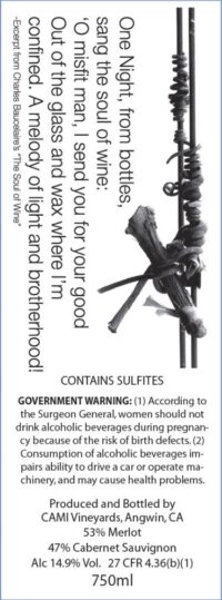

A tendril sweeps the front of the CAMi label symbolizing what remains from the past, the wine behind it, the spirit of a twig. Winemaker Tom Shelton’s son, Trevor Mansfield, created the design concept—photography plus poetry—to commemorate the life of a poet, philosopher, wine advocate, and a father. Mansfield explains, “Robert Frost was his favorite poet and the poem ‘October’ reminded me of my final days with my father. Each poem that appears on a label is meant to be incorporated into a toast, as Tom often placed poetry at the perfect moments, especially in his toasts.”