
Six local experts on 2023 color trends
Isn’t it remarkable how a global event—in this case, a pandemic—creates giant ripples that bring change to so many aspects of our daily lives? More time spent at home these past two years has left us with bags of time to reconsider the color scheme: walls, cabinetry, artwork, window treatments, seating, and soft furnishings.
Color is the Word
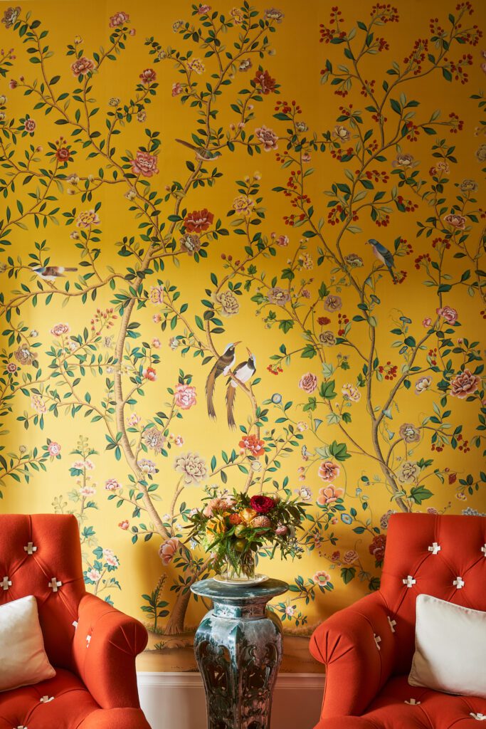
Color is the word on everyone’s lips, and inspiration is coming from unexpected places beyond the world of design. In partnership with the Pantone Institute, Discover Puerto Rico designed an exuberant, new, limited-edition orange-yellow hue called Puerto Rican Sunshine.
By combining science and emotion to capture the shade of the island’s sunshine, Héctor J. Jiménez, Ph.D., a physicist at the University of Puerto Rico, took on the brief. Through a series of models and calculations, Dr. Jiménez measured everything from the sun’s temperature to its movements around the island throughout the day. Then the tourism board worked with San Juan-based interior designer Cristina Villalón and ECOS Paints® to bring sun in a can into our lives.
Pantone Color of the Year 2023

Now, Pantone has spoken for 2023, tapping a bold shade of crimson red “that speaks to the strength and vitality needed for forging a more positive future.” PANTONE 18-1750 Viva Magenta is a selection that draws on both warm and cool tones. The Pantone Institute’s executive director, Leatrice Eiseman, indicates that the 2023 Color of the Year communicates power in an assertive, not aggressive way, saying Viva Magenta is an “animated red, pulsating with movement.”
Not Afraid of Color
Thanks to several leading San Francisco interior designers and decorators, we collected additional thoughts on what else is hot in interior residential color trends for 2023.
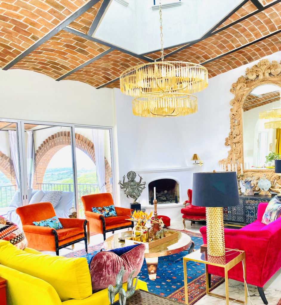
Step into his jewel box of a showroom in Mission Dolores at New Deal Home to get a sense of why Terje Arnesen, a tall Norwegian, declares “I’m not afraid of color!” From designing interiors for a Pac Heights penthouse to a Balinese villa, Arnesen is all about color being fun. (Note: We fell hard for the set of four Empire dining chairs custom upholstered in vibrant stripes of reds and oranges.)
“I always tell clients what makes their place interesting and personal is how you mix it up—that’s what gives it personality and makes it interesting. And please … add some color!” He assures clients, “You can put any colors you want together, but it’s what you do with everything else that makes it work.”
When the conversation turned to “Things I Love” and “Things I’m Not Crazy About,” Arnesen was keen to point out that surprise and delight color combinations gets a thumbs up and a pet peeve is feature walls without any direction. He suggests juxtaposing tones that don’t conform to any standard such as a color wheel and avoiding matchy-matchy or a sea of the same color. Art and artifacts are all-important: “something stimulating to look at” will include “older pieces that you absolutely want to keep in your life.” newdealhome.com
Sexy, Darker Ceilings
Gioi Tran, Partner, Applegate Tran Interiors + Poliform San Francisco commented, “We see a few trends heading into the next year: saturated neutrals, mid-level sheen, and dark ceilings. More and more homeowners will paint their ceilings darker than the walls, adding height and intrigue to the overall room. Although we love bright and bold colors, it is not for every client, and although they don’t want pure white walls or ceilings, they also don’t always want a bold, saturated color, opting for more layered neutrals.”
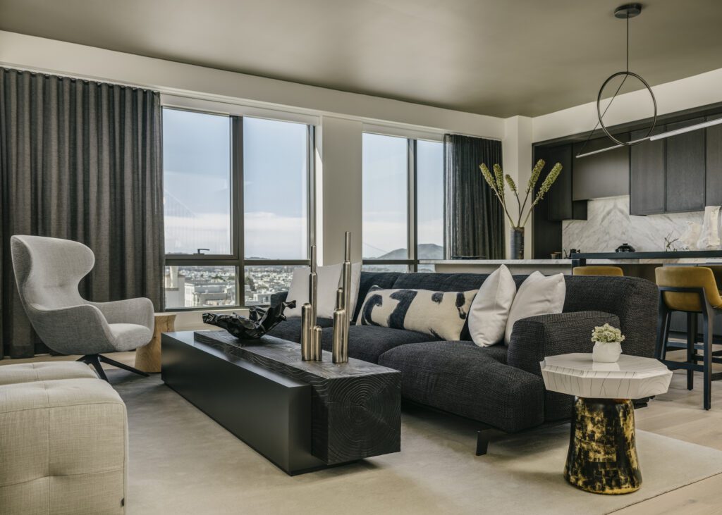
Describing a residential interior in Cow Hollow, Tran added, “In a recent project, we painted the walls a warm, chalky off-white and paired it with a grey mushroom ceiling in an eggshell-like mid-level sheen. The neutral tones are warm and welcoming and are certainly not plain white walls, as they have depth and movement from the shine. The darker ceiling adds a sexy, masculine aesthetic that feels more European and juxtaposes the sculptural furniture.” applegatetran.com
California Warm
Interior design icon Suzanne Tucker creates beauty that leads the way. “I’m consistent with my use of color as far as keeping an overall mood slightly warmer than cooler, though that may be partially attributed to my California roots. Even with gray I will add a hint of warmth to it and I love the juxtaposition of warm and cool colors together. But that’s where my consistency ends. You cannot assume the same color will work in every project—the variances between geographic locations, which direction a house faces, how the light comes into each room, what’s outside: all those things and more play into how I select my colors. I do love working with color though, so it’s great fun for me when a client loves color, too!”
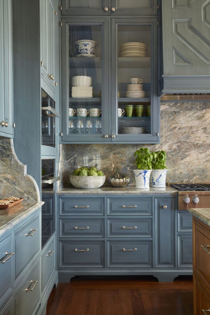
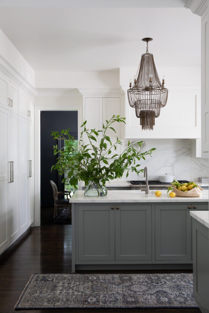
She adds, “Having said all of that, these days, I’m really liking a flattering ‘warm’ blue. This may seem like a contradiction in terms, but the right blue can be incredibly soothing and comforting in an interior; it does not have to be cold. Here’s an example of a San Francisco kitchen with hand painted cabinets in a denim strié finish.”
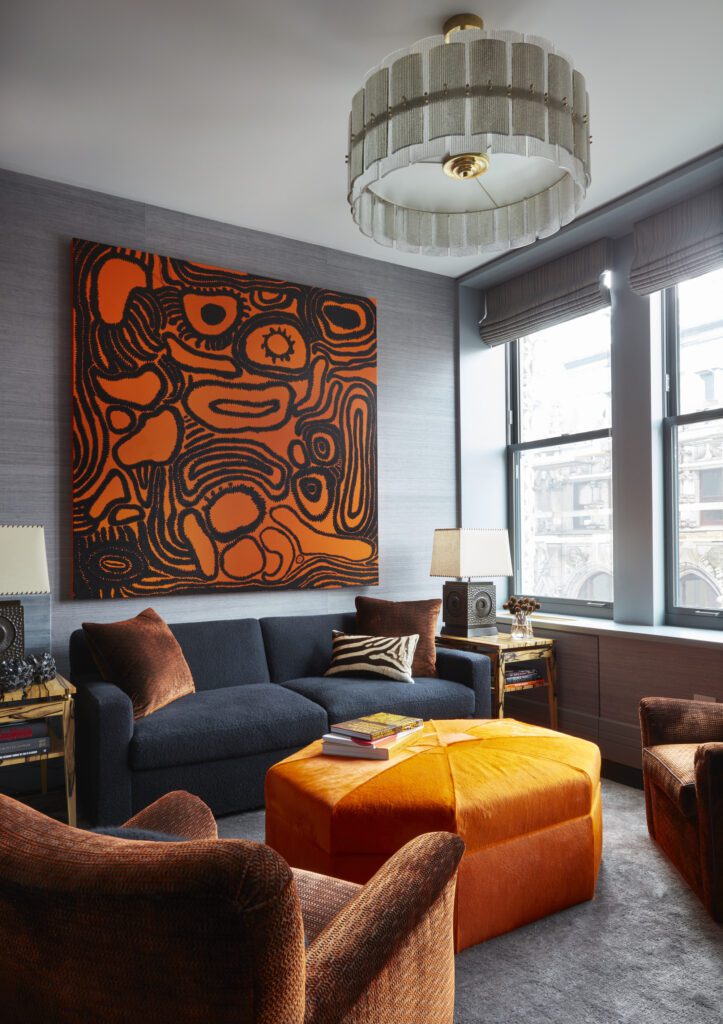
What about Viva Magenta? “I do love the 2023 Pantone color … a strong and upbeat, positive and happy crimson. But I’d use it in small dose, as I’d rather wear it than live surrounded by it!
For interiors, I would opt for a softer pink, which is hard to pin down—not too blue, not too ‘Pepto.’ You don’t want your home to look like Barbie’s playhouse. The Blossom colorway of our new Cachepot print is a good example.” suzannetuckerhome.com
Be Bold
A veteran of six San Francisco Decorator Showcases, Tineke Triggs, Artistic Designs for Living, nails it. “I think we’re going to see a lot of warm tones used in 2023, such as rust, ochre, plums, dark greens, and browns. These are cozy colors that bring a sense of relaxed sophistication and style to any space.” tineketriggs.com
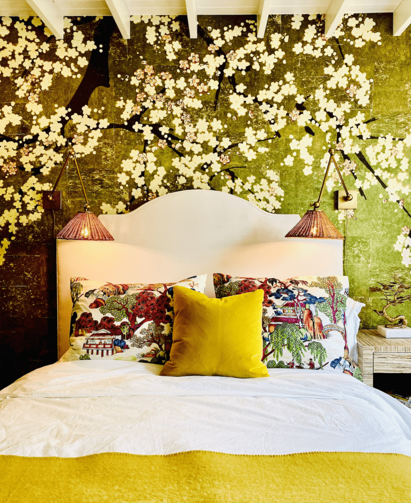
Known for her collaborations with de Gournay, Dina Bandman concurs, “Bold colors are having a moment right now, including primary colors such as vibrant yellows, cherry reds, and cobalt blues—colors with a lot of punch. People are beginning to use these colors to bring more uplifting and energetic design elements into their homes.” dinabandman.com
Keen on Green
Founder and principal designer for the San Francisco Bay Area-based interiors firm that bears her name, Amanda Barnes touts green for 2023. “I anticipate we will continue to see a lot of earth tones, especially many shades of green. Whether it is on cabinets or walls, this verdant shade will be everywhere. Like many other hues, finding the right color means balancing the undertones of the green, as many read a little gray in the late evening light.”
In paint, one of her favorites is Pigeon byFarrow and Ball. “This soft greenish, grayish paint color was named after the bird and brings warmth to every surface. I have this shade in my own kitchen, and it boasts a robust green tone in daylight, while it softens to a balmy gray color as the sun sets. This is a failsafe green shade for any home.” She also likes Fieldstone, Raindance, and Black Forest Green by Benjamin Moore. amandabarnesinteriors.com