
Literature lovers might recognize Crescere Wines’ label art. The Sonoma County producer of premium, estate grown Cabernet Sauvignon and Syrah tapped London-based Yehrin Tong to design its ethereal logo. Yehrin is well known for her hypnotic book cover illustrations, specifically the Virago Modern Classics 40th Anniversary Series, for which she received the V&A Book Cover Illustration Award in 2019, the UK’s most prestigious annual illustration competition.
After agreeing on the name Crescere for their 2016-established winery at which world-renowned Philippe Melka serves as consulting winemaker, proprietors Joe and Elena Reynoso knew they wanted a wine label design rooted in nature. It had to be classically beautiful and convey their environmental commitments, as well as the beauty of their wines. The duo was intrigued by both the koru, a Maori symbol that symbolizes new life, growth, strength, and peace, and by fractals, infinitely complex patterns across different scales that occur throughout the natural world. Yehrin’s fractal focused artwork proved to provide the perfect aesthetic.
Yehrin works across a broad range of mediums from print, CG and digital, to motion and physical installations. Her clients include Adidas, Apple, BBC, Bombay Sapphire, Canongate, Conde Nast, Dell, Grafik, New Scientist, New York Times, Penguin Random House, Prado Museum, Procter & Gamble, Simon & Schuster, The Future Laboratory, Victoria and Albert Museum, and Virago. The Crescere project is her first venture into wine.
“The moment we received Yehrin’s art, we knew it was what we were looking for,” said Elena. “Its beauty, graceful movement, and strength were like a totem. We were quite overwhelmed.”
Haute Living San Francisco asked Elena to elaborate:
HL: How were you first made aware of Yehrin’s artwork, and how did you initially get in touch with her?
ER: We were first made aware of Yehrin’s work by Gauge Branding, with whom we were working on the creation of the label. Mark Wiegard, the creative director, had initially seen her work in industry magazines and got in touch to ask her to create a work based on the koru.
How and where were you introduced to the koru?
 We were introduced by Mark, who was designing the label. We wanted something from the natural world that was classically beautiful and would convey our commitment to cherishing and honoring the land, as well as the beauty of the wine that we were hoping to create. Mark sent us about 15 bottle mockups with different label ideas; butterflies, flowers, mountains, bees, dolphins, leaves. They were all lovely, but the koru was what spoke to us. Joe and I are really fascinated by octopuses and it reminded us of their beautiful arms – the fact that the final design was so evocative of an octopus was a happy accident, as we never mentioned our affinity to anyone. We really didn’t even consider the other options once we saw the koru. The choice was obvious to us pretty much immediately. It symbolizes new life, growth, development, and peace, and is classically beautiful, perhaps because it incorporates the principle of the “Golden Ratio,” present throughout nature (and art). Yehrin works with fractals, which incorporate the Golden Ratio. The circular shape helps convey the idea of perpetual movement, while the inner coils suggests a return to the point of origin in an infinite repeating pattern; it grows (and diminishes) by the Golden Ratio, or Phi. It is graceful, powerful, quiet, and full of motion at the same time.
The design that Mark used was actually from one of Yehrin’s works in The Book of Strange New Things, in which her art is largely based on fractals. At that point we had to decide if we wanted to have Mark create a drawing of a koru for the label, or if we wanted to ask Yehrin to create it. We were so taken with her work that we ultimately asked her to create something based on the koru.
How did the process work?
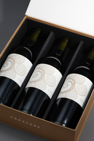
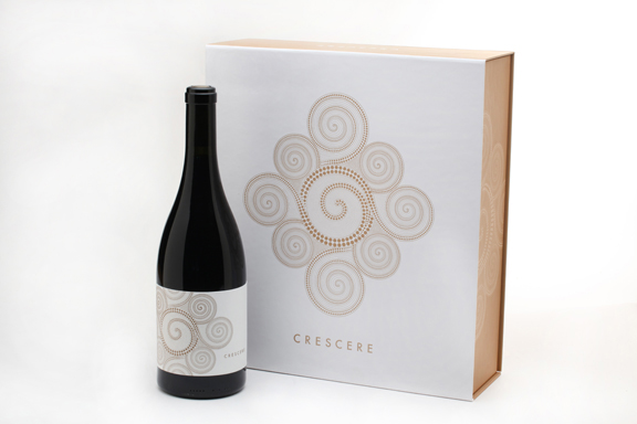
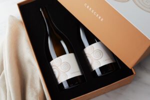
The process was quite simple. Mark reached out to her and asked if she could do what we requested for the label. She said “yes,” and a couple of weeks later we had the design. We didn’t need to work on, or fine tune the image; it was perfect the way it was. We use the full image on our boxes and stationery, and an offset, truncated version on the labels. The image was exactly what we were looking for. Yehrin nailed it. Though we never met in person, somehow, she completely “got it.” Like magic. Everything was done electronically. Once we had the art, Mark created the simple font and placement of the design on the label. We wanted something very simple that would allow Yehrin’s gorgeous work to take center stage.
Do you now own the original, and if so, is it displayed somewhere?
We do own the original, which is a computer file. We have not had an artist render it as a painting. We might at some point but based on how complicated it is to render it correctly on a label, (which, I assure you is difficult!) we may never try it. I do display on my desk one of the beautiful gift boxes in which the wine arrives.
How did you come up with the name for your wines/winery?
Ah, the process of coming up with a name. It turns out that this is really difficult! Going back to what we held to be a “farming-first” philosophy, our key words were “to grow, to ripen, to bring Nature forth.” I am the daughter of a professor of linguistics at the University of Chicago, so I was always around dictionaries and foreign languages. I just decided one night to find out what “to ripen” was in Latin. Turns out that it is “crescere,” and it is the same in Italian and French, though pronounced differently. I loved the word; it was beautiful when spoken, and so perfectly balanced in print. I presented it to the team and everyone liked it and thought that it was what we had been trying to achieve – a single word that could elegantly convey our commitment to nature and farming. The fact that it was an old word brought history and permanence, which also was appealing.
Photos courtesy of Crescere Wines