
In love with paint colors? You’re not alone. Nothing makes a mood-boosting difference quite like a fresh coat of paint on walls and ceilings.
In a highly anticipated moment, the leading paint companies have made their Color of the Year 2024 choices for top trends in interiors. These annual paint color picks and complementary palette recommendations are not made lightly. Each selection is the result of input by color thought leaders, consultation with expert teams, global trend analysis, and consumer-based research. As Benjamin Moore puts it, “Informed by cultural influences the world over, the Color of the Year and its corresponding color trends palette is selected from our existing library of 3,500-plus hues. ”Interestingly, the six 2024 paint company’s elections fall squarely into two distinct camps of cheerful soft blues and dark mood setters with just one distinct outlier choice.”
Benjamin Moore: A Classic, Dreamy Blue
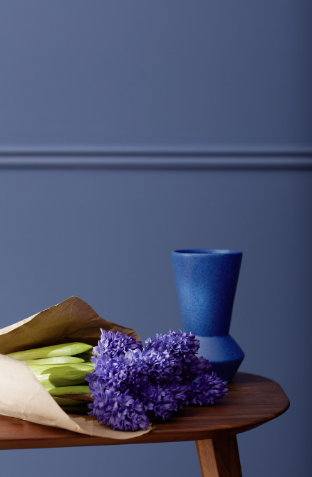
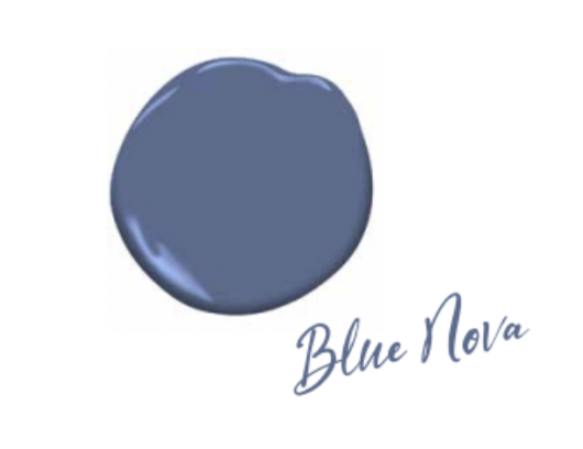
Reminiscent of a fragrant lavender field in the south of France, Blue Nova 825 is a calming saturated tone, falling somewhere between blue and violet. Interestingly, Benjamin Moore describes their inspiration as being more about outer space exploration than grounded in earthly florals.
Either way, this is a dreamy blue. The company’s Color Marketing and Development Director Andrea Magno says Blue Nova is “an alluring mid-tone that balances depth and intrigue with classic appeal and reassurance.” Regan Baker of San Francisco-based Regan Baker Design suggests that when this “country chic vibe with pretty lavender undertones is paired with cobalt blue and purples, it could really pick up on those tones.” Conclusion? This year’s pretty Blue Nova offers something for everyone.
One could cheerfully drench all four walls of a room in Blue Nova, or use it to highlight architectural features like molding, a fireplace, doors, windows. It’s a highly versatile color for contrasting with popular White Dove or for pairing with any of the gorgeous colors in a sunset sky.
Founded in Brooklyn 140 years ago and acquired by Berkshire Hathaway in 2000, Benjamin Moore & Co. has long been one to watch. Now sold by 7,500 independent retailers across the US, the paint company has innovative Color Matching Devices to interpret paint colors in the Benjamin Moore Portfolio® via Bluetooth® technology, in case you find inspiration while out shopping or on the go.
Behr: Smoky, Bold, and Moody Charcoal
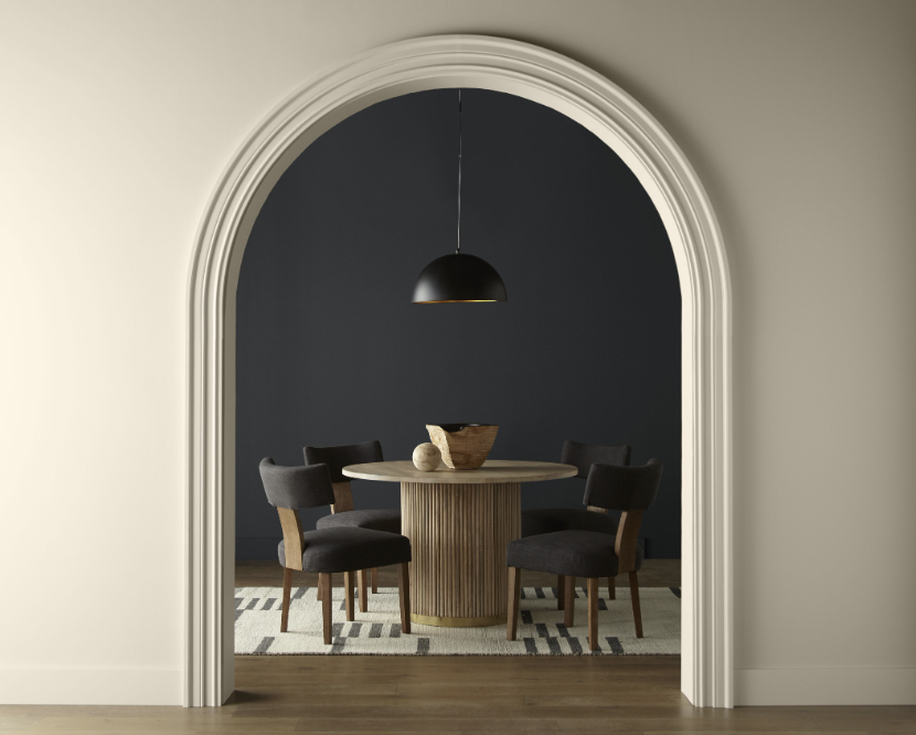

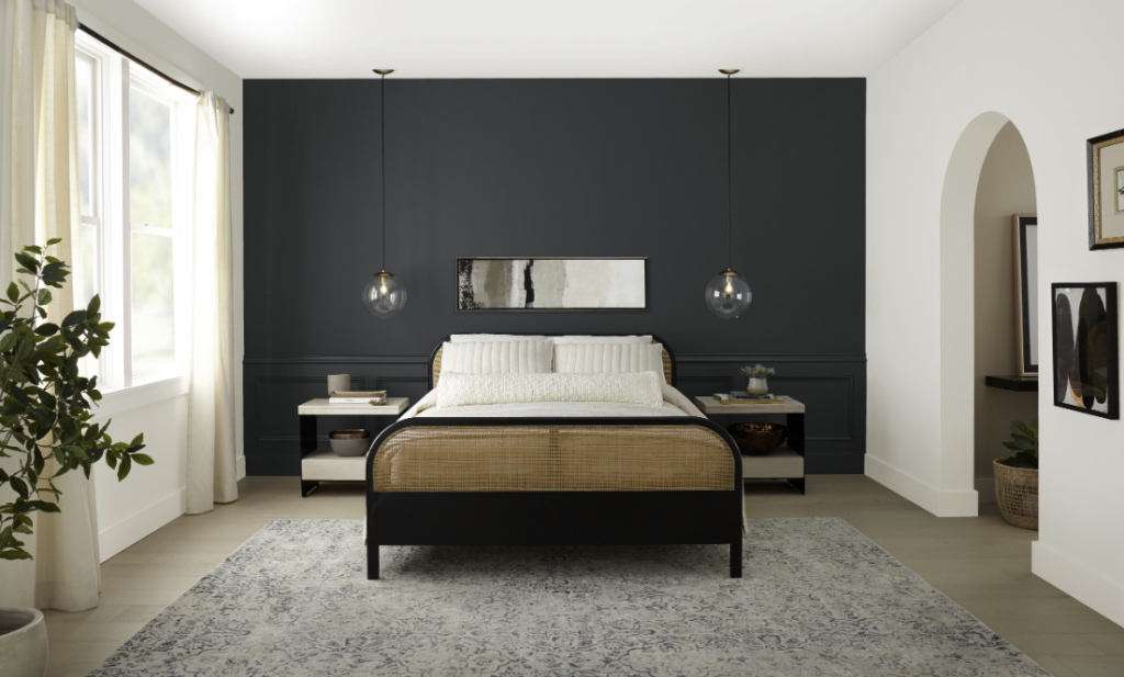
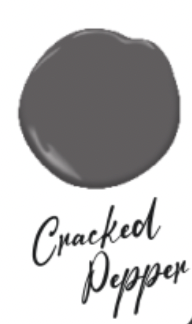
Cracked Pepper PPU18-01 is a statement choice with undertones of charcoal in a shade that Behr calls “versatile soft black.” Very smoky, extremely bold and moody, Behr says this is a “timeless and modern hue that awakens the senses and exudes confidence.”
Getting behind a trend toward black, Behr Paint Global Chief Marketing Officer Jodi Allen said, “We recognize the growing desire for using darker colors throughout spaces. Adding a soft black like Cracked Pepper evokes a sense of confidence and individuality that we want all of our customers to feel after completing a project.”
As dark shades become more appreciated in the home, Behr research shows:
- Three-quarters (74%) of Americans would consider painting an area or room a dark color.
- More than half of Millennials (61%) agree black tones instantly give the home a fresh look.
- Half (50%) of Americans say darker colored walls create a sense of comfort in the home.
Endorsing Cracked Pepper, Regan Baker of Regan Baker Design says, “Really pretty, nice black with blue undertone that is calming. It pairs nicely with wood tones given proximity on the color wheel—orange and blue create a nice contrast. And because this is more of a blue black, it’s not so harsh. A nice one with depth.”
Behr suggests that pairing Cracked Pepper with a palette of fresh, creamy, earthy, and unassuming colors would work well.
Glidden: Anything but Grey
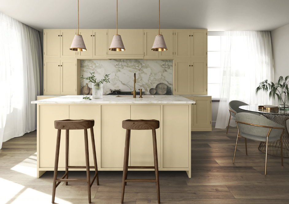
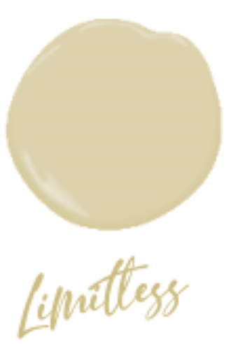

Call it honey, call it beige, but don’t call it yellow when referring to Limitless, the color paint pick by Glidden for 2024. A happy medium between neutral and warm, buttery Limitless looks at home in a kitchen mixed with elements of brass fixtures, marble countertops, and wood floors.
A soft, muted, sunny citrus with a mustard-yellow undertone, Limitless represents a departure from gray, which Glidden calls “officially canceled.”
Ashley McCollum, PPG color expert on behalf of Glidden, says, “Consumers are using color in even more unconventional ways than ever before and they need a palette that offers versatility to work with both new and existing decor. Limitless understands the assignment and embodies this perfectly.”
Valspar: A Sense of Peace
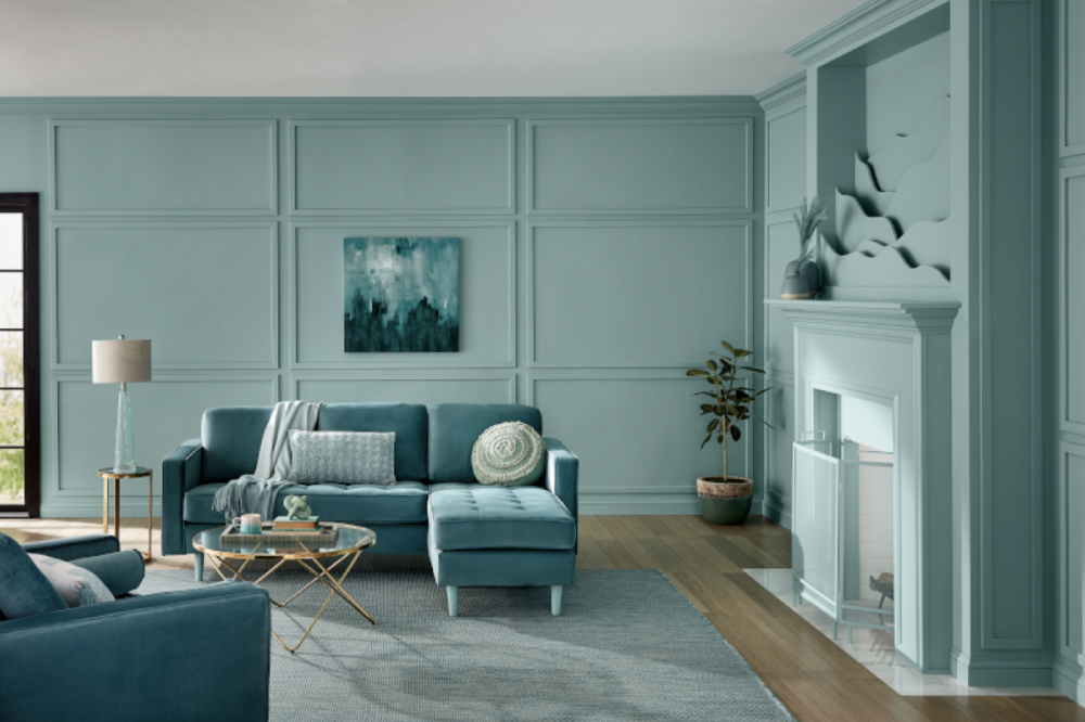


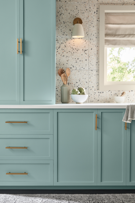
Beach house, anyone? If the coast is your happy place, look no further. Renew Blue 8003-37D is a green-inspired blue that’s a stress-buster hue. Valspar Director of Color Marketing Sue Kim says, “The concept of home is evolving to include a feeling as well as a physical space.” She adds to the thinking behind choosing this best of both worlds chalky blue-green saying, “2024 will be an important transitional time as we come out of a recession mindset, as we go from pandemic to post-pandemic. Renew Blue will signal that.”
Noting that this is “a more calm and comfortable beach versus a more vibrant Miami beach vibe,” Regan Baker suggests that “…pairing Renew Blue with more grey tones, pastels, and whites mixed in could work well.”
“I would describe this color as a muted Tiffany Blue, and I can see why it would make a comeback now. The last few years have been saturated with ‘natural neutral’ interiors, and the cheerfulness of this color is a good reaction to this minimalism, if used thoughtfully,” says Dana Feagles, the principal designer of Revelry Interior Design based in Northern California’s wine country.
Sherwin-Williams: Up, Up, and Away Breezy Blue
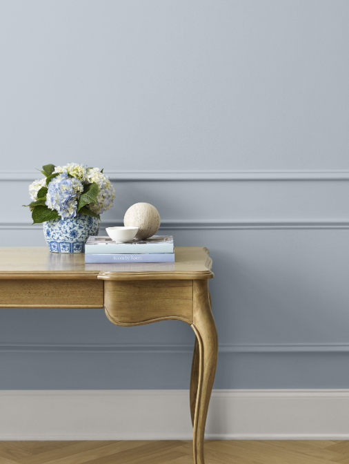

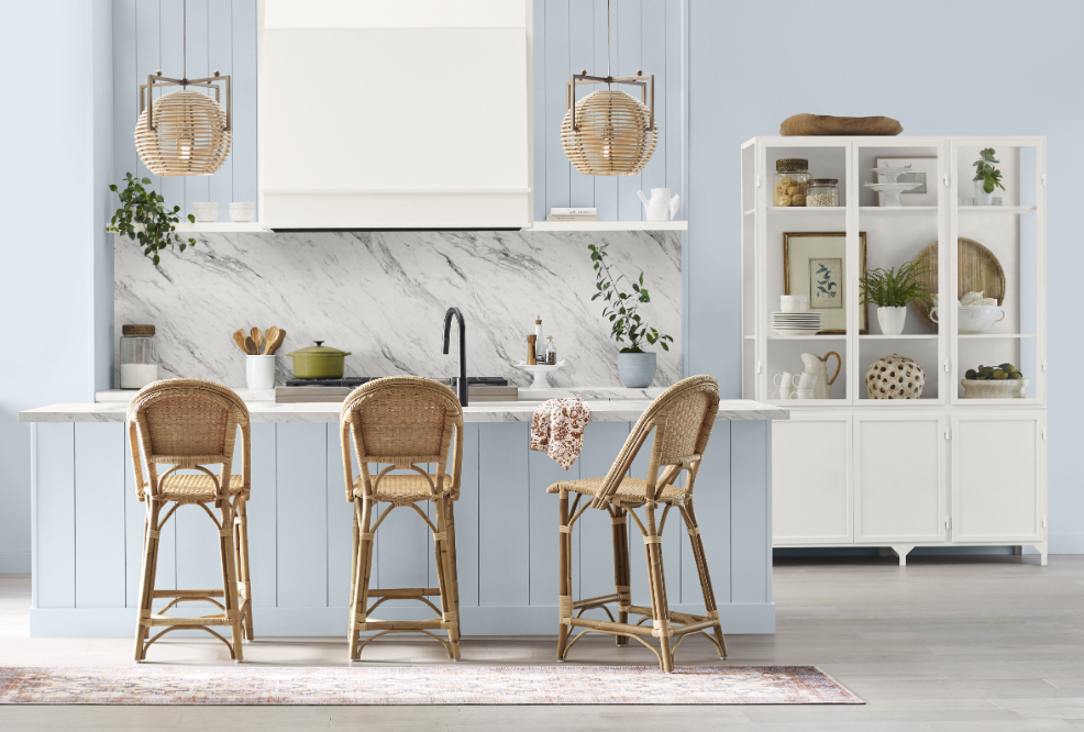
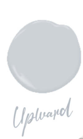
Sherwin-Williams goes with a breezy blue shade that’s cool, calm, and collected as their top trendsetter for 2024. Upward 6239 is an uplifting blue-gray that the company says “encourages boundless creativity.” It’s a peaceful, non-controversial choice to conjure up relaxation, tranquility, contentment.
Sue Wadden, Director of Color Marketing at Sherwin-Williams, talks about what this year’s color choice means to her. “Upward is the ethereal dance of ambition and dreams, an ascent toward the limitless skies of possibility. It’s the daring leap that transcends boundaries, the intrepid flight that defies gravity’s constraints. Upward is the pulse of inspiration, the cosmic tug that urges us to reach higher and embrace the uncharted realms of our imagination. Upward is the ever-ascending spiral, propelling us to soar beyond the stars and write our stories among the constellations of greatness.”
Upward gets an endorsement from Dana Feagles of Revelry Interior Design. She says, “I would put this color in the muted French Blue category, with more modern gray undertones, which makes it both classic and new. It’s a nice, calming color if you want a soft blue that doesn’t make your space look like a baby’s nursery.”
Dutch Boy: Comforting, Deep, and Dark Olive
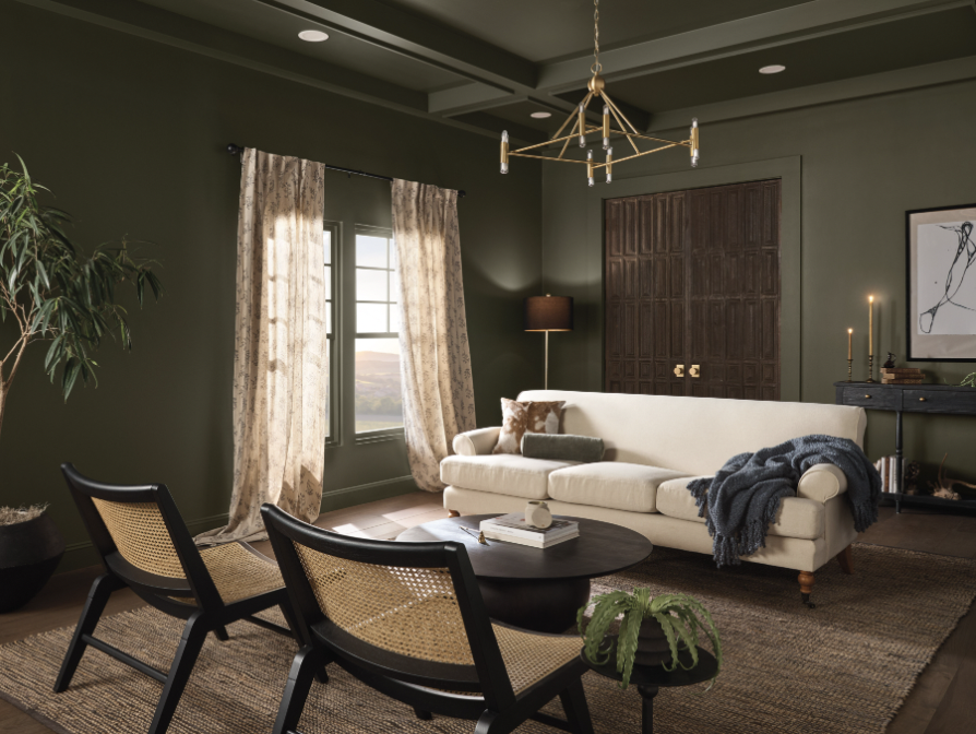

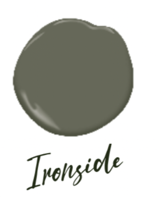
Legacy brand Dutch Boy Paints, part of the Sherwin-Williams family, took another direction by going deep and dark in naming their 2024 One-Coat Color of the Year. Considered to be “soothing and reassuring,” Ironside 422-7DB is a rich olive shade with undertones of black, rooted in comfort to create a space that is elegant and charming.
Describing this color vibe as comfortable sophistication, Dutch Boy Color Marketing Manager Ashley Banbury said, “It’s very approachable, it’s very usable, and it’s very comforting.” She added, “Creating a space for wellness should be a driving factor in everyday life; that’s why taking a natural approach to healthy living and safe spaces is a pivotal part of the current landscape.”
The company says this deep olive is versatile in wide-open spaces or enclosed comfy places, reflecting well-being from all angles. And for those ready to introduce some olive green at home, Dutch Boy Paints curated three different color palettes to harmonize with Ironside.
At Revelry Interior Design, Dana Feagles is a fan of Ironside. She observed, “This is a great color to go with the ‘quiet luxury’ design trend, even though it’s a bit somber. It’s a rich, understated green that can enhance a space without drawing attention to it. I can picture this color in a sophisticated bedroom, a study, or even a cozy media room.”
P.S. First impressions count. Don’t forget a fresh coat of paint for the front door and entryway.
Images courtesy of paint companies